
Getting users to your website is not enough.
You must make sure you keep visitors on your site once they have landed. You have to make sure those visitors don’t bounce.
But if you, as ux professionals, only focus on the design of your homepage, you may not improve your average bounce rate. You have to focus on the ux design of all your other pages.
This might be counter-intuitive, but:
Your top landing page is not your homepage.
→ If you are selling products online, a lot of traffic lands on your product detail pages.
→ If you are writing lots of content, many of your readers may go straight to your blog posts.
To optimize your website traffic, you need to think strategically about how to keep users engaged on the landing pages your users see first.
So how do you keep users engaged? Provide them with some personalized journey options through the use of website recommendations. You can improve your customer’s experience and significantly decrease bounce rate through the use of your on-site recommendations.
By providing personalized content to your users on landing pages, you will keep them on your site for longer, thus increasing pageviews and conversions.
What should I consider during the design process of creating a recommendation area?
The decision to implement on-site recommendations is great, but you must be strategic on placement to maximize the benefits.
Whether you run a website with lots of content or an eCommerce-driven business, use these 5 tips to help guide you:
Tip #1: Continue the reader’s journey at the end of the article.
For articles containing video, we suggest placing your recommendations either in the middle or at the end of the article.
Placing more content recommendations at the end of your shorter articles helps continue your reader’s journey. The user is most likely to read the next article right after finishing the current one.
For longer articles, consider putting an in-line recommendation area in mid-article as well. When you place website recommendations in the middle of the article, you can catch the readers before they lose interest.
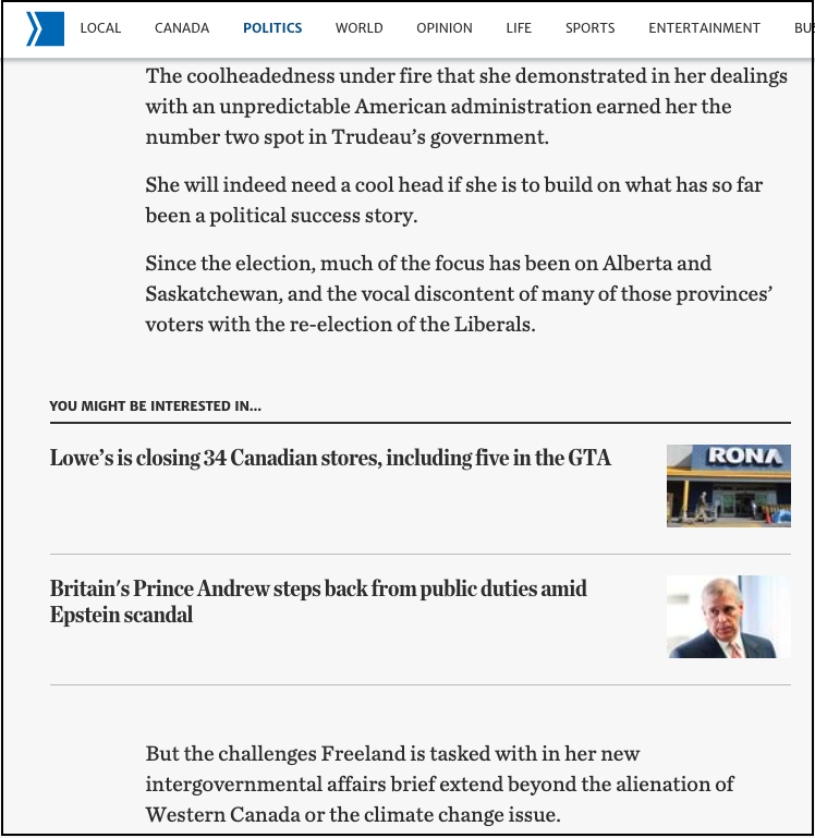
[Mid-Article Recommendations on Thestar.com]
Most often, you will find the space directly following your article to be the most effective placement. Also, if you want to optimize for mobile, the end of the article placement will create a more consistent experience.
Tip #2: Include pictures where possible
Pictures speak a thousand words, and this is no exception. You will want to be thoughtful about which pictures are included, but be sure to include them nonetheless. An area with recommendations that includes pictures will receive a much higher number of clicks than text-only recommendations in the same space.
If you are showcasing additional products to increase e-commerce conversion, pictures are absolutely essential, no matter where the placement is.
There are exceptions to this rule, however, especially when you consider the mid-article area in longer articles. If you keep the user experience design in mind, text-only content recommendations may be less intrusive to the customer experience.
Tip #3: Showcase the product and product summary before showing additional products
When placing product recommendations on a product detail page, these recs should display underneath the product image and perhaps its description, depending on length.
If you place additional product images too close to the top, you may confuse the user. To create a better user experience, it’s better to suggest products as a complement to the current item.
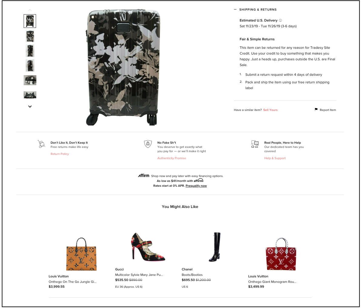
[Product Recommendations on Tradesy.com]
On the other hand, keeping buyers engaged is still problematic. You still want your recommendations to be within the viewport. Limited scrolling should be required to see additional recommended items or products.
Remember, also, to leave space for the images that accompany additional product descriptions.
Tip #4: Watch out for the right rail
Placing recommendations on the right rail, even on product detail pages, can be tricky. Because ad placements have been used in that area for many years, desktop visitors tend to expect little information of value in that space.
The right rail widget is a good option if you want the navigation to persist as the user scrolls. However, users may not click if they expect that the navigation will lead them away from the page. Consider text-only recommendations in this area to signal to your readers that these are native links.
If you do choose to use the right rail area, maximize your visibility. Ensure that the native space is above the fold. Be sure the area is always visible, so users can click on the recommended content at any time.
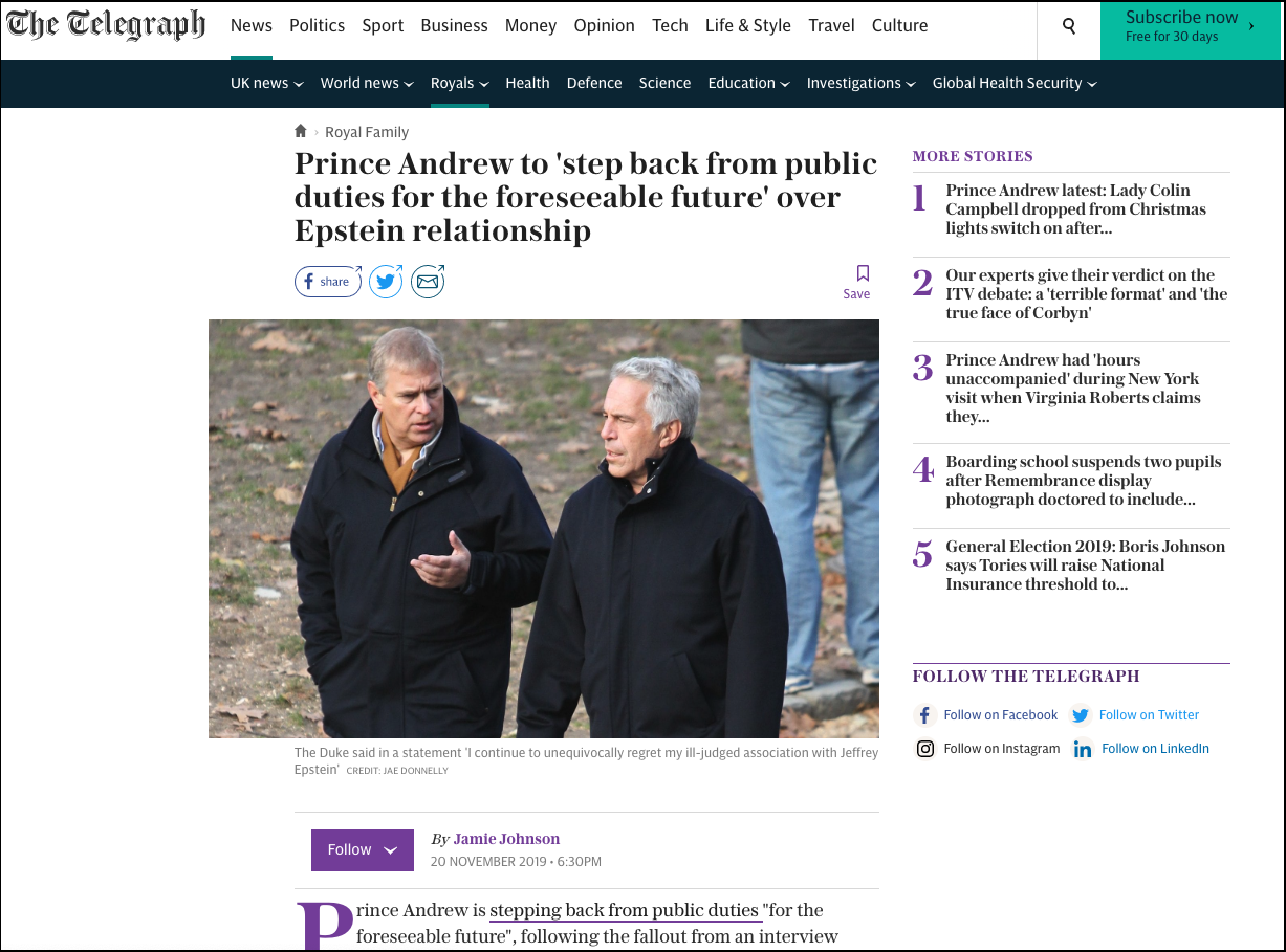
[Text-only Right Rail on theTelegraph.co.uk]
Tip #5: Gain your visitor’s trust with a truly native experience
Make it obvious that you are recommending your own content. Ensure that any user interface design follows the same style guides as the rest of your content.
Recommend other articles or products that are relevant to your brand and look like the rest of your content. The user centered design will help site visitors feel understood and comfortable.
You may also decide to clarify the personalized recommendation area by introducing a clear label. Examples of good labels might be “Recommended for you” or “You may be interested in”.
Additionally, stay clear of working with companies who use shocking and disturbing ads to generate revenue, as this can irreversibly reduce your users trust.
If you are consistent with the design and user experience with areas that are truly native to your site, key performance indicators will improve.
Putting website recommendations in the right place is essential to decreasing bounce rate.
How and where you show website recommendations have a major effect. To improve the user experience and make your website visitors extend their on-site journey, keep these 5 tips in mind.
Remember this advice, and you will see a major impact on click-thru rates, page views, and conversions. After all, it would be a shame to have all that qualified website traffic just bounce.
